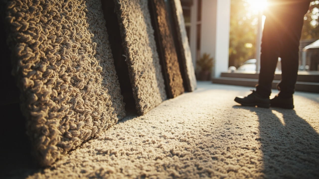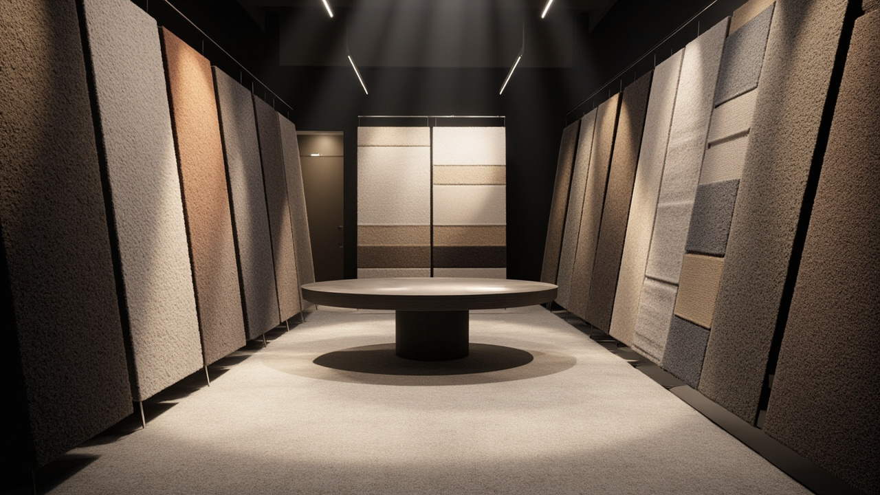
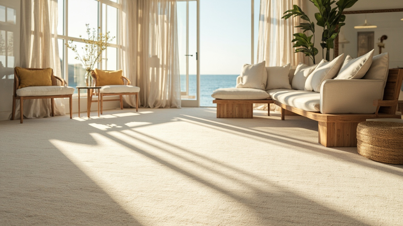
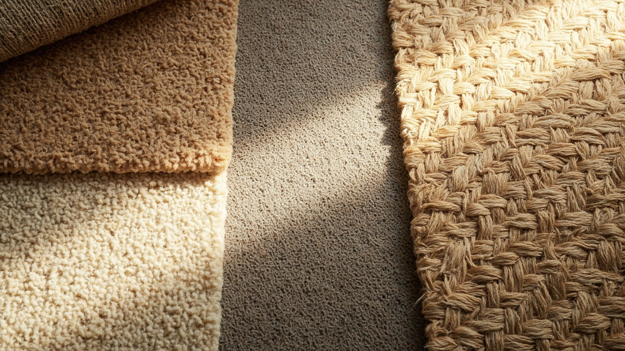
Hamptons carpets are rooted in a light, airy, coastal mood. In Sydney, practical Hamptons palettes stay within soft neutrals—think warm whites, creams, pale beiges, and light greys—paired with occasional coastal blues or navy accents. Materials such as wool, sisal, or jute are commonly used, providing natural texture and warmth underfoot while remaining durable in day-to-day living. Textures range from subtle looped weaves to soft cut-pile velours, all designed to look refined without being fussy. Patterns tend to be understated: delicate stripes, light plaids, or simple solid tones that reflect natural light and keep spaces feeling open. Consider finishing touches like leather or linen furnishings to keep the palette cohesive. For coastal Sydney homes, it’s wise to balance light tones with a few darker accents to hide dust and maintain depth. If you’d like, I can suggest a few sample swatches that pair well with your room’s light exposure and existing furniture.
Public Q&A
Which colour palettes are most practical for Hamptons carpets in Sydney?
Useful next steps
Use this answer as a practical starting point. Current prices, availability, inclusions, ownership details and next steps should be confirmed directly with Carpet Sydney where they affect a decision.
Related Topics
Continue Through Related Topic Pages
Explore more topic pages connected to this answer.
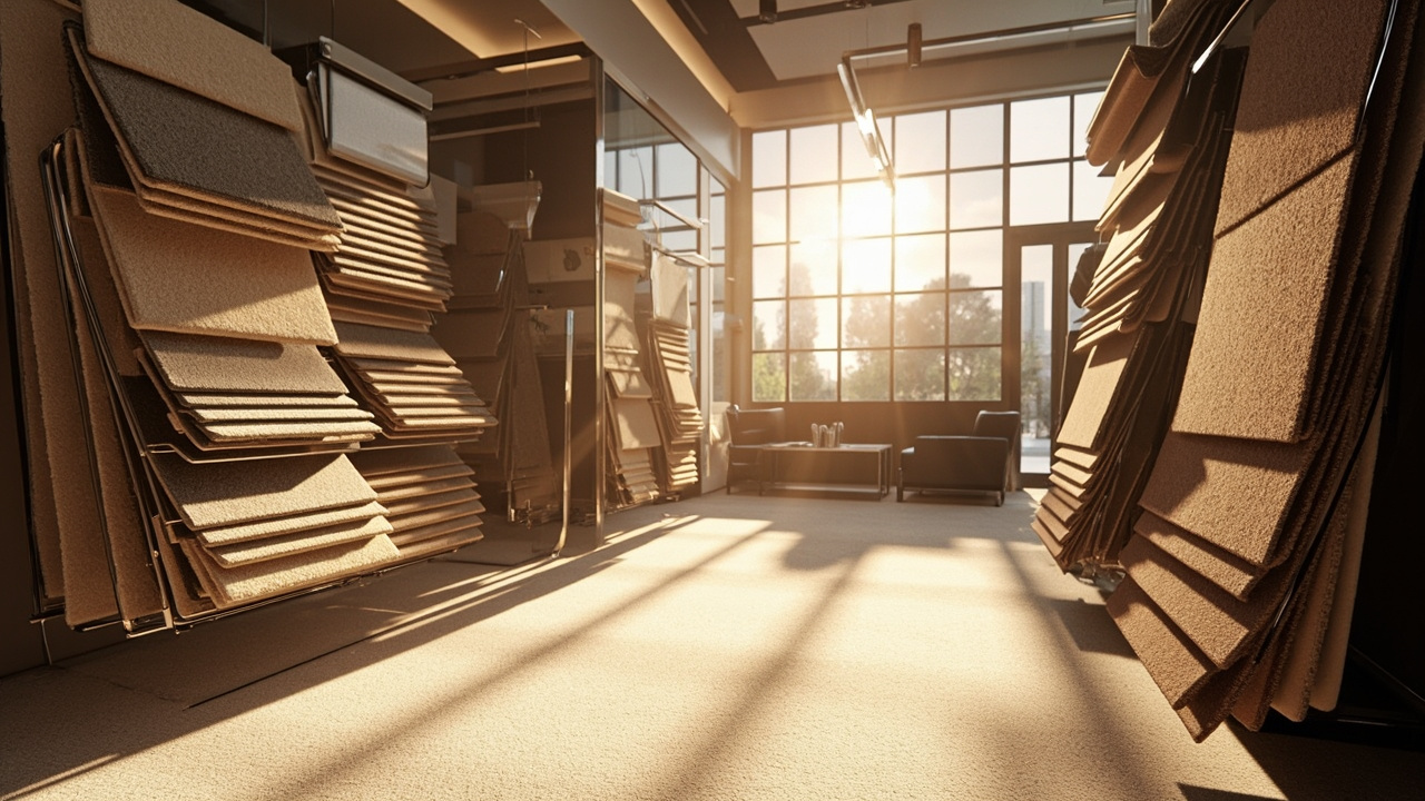
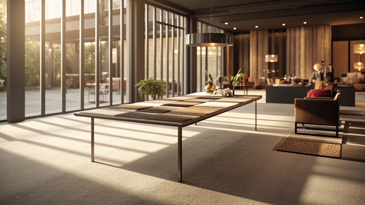
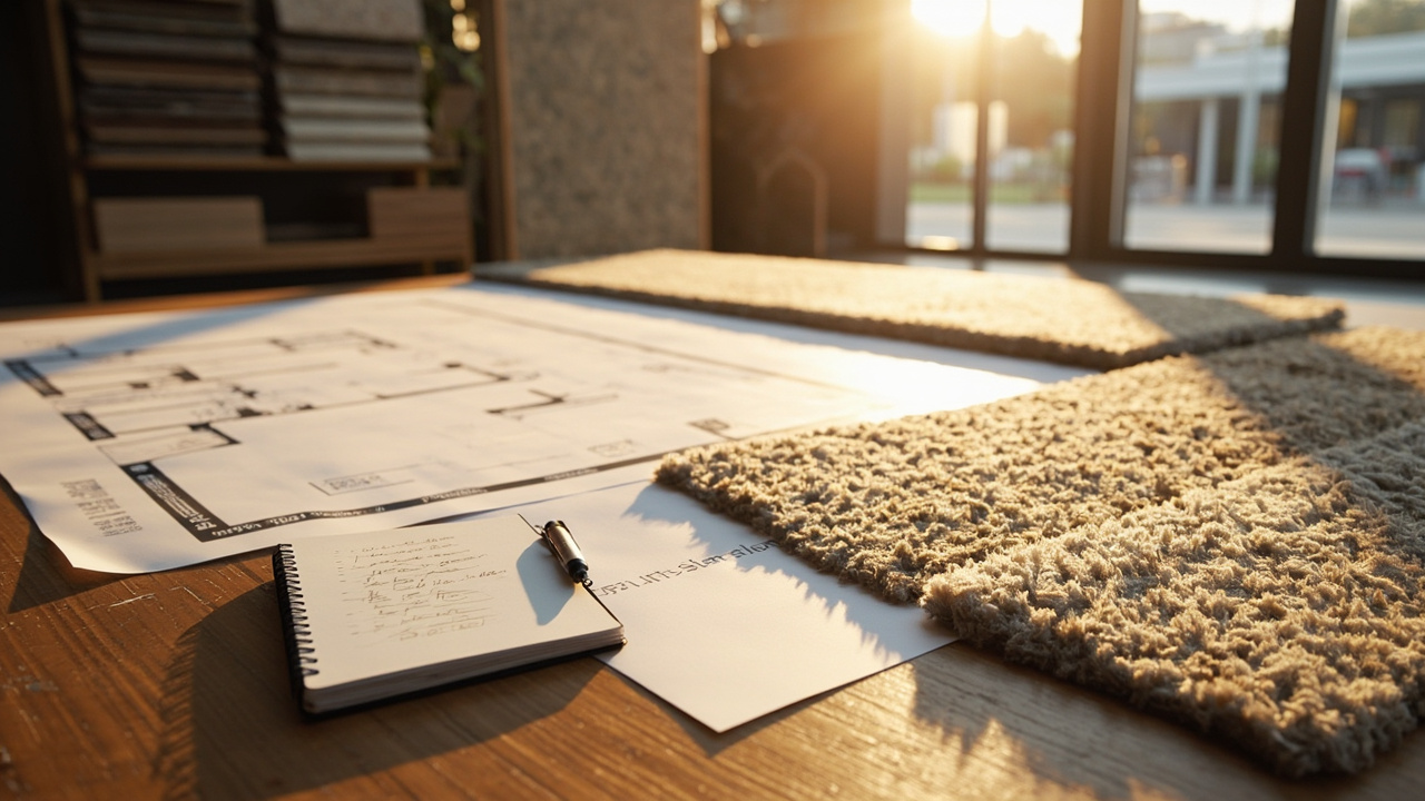
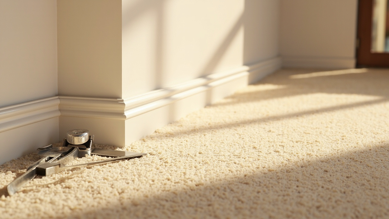
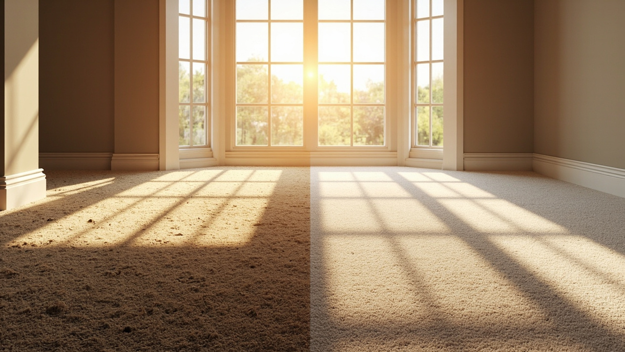
Related visual examples
A short visual sample connected to this answer or its topic.